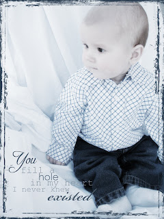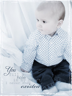
So... came across a tutorial on making digital photos look handtinted... and experimented using one of the photos from Nathan's 6 month shoot I did on Thursday... TOTALLY love the outcome! If any of you are interested in the link, it's posted at my scrapblog. Isn't he just too darn C.U.T.E.!?!! I didn't know which one I liked better..  the one with the blue frame or the white one. The blue one definitely shows up better... but can't quite decide if that detracts from the overall photo... hmmmm...Any thoughts????
 the one with the blue frame or the white one. The blue one definitely shows up better... but can't quite decide if that detracts from the overall photo... hmmmm...Any thoughts????


2 comments:
I LOVE the one with the blue border. What a great shot! :)
love the pictures. i would love to see more. dang he is too cute. i think i need photoshop lessons too.
Post a Comment